Portfolio
Beloved clients







Photoshop skills and creativity are important, but not as much as the art of listening. I get to know you, your business, your vision, your aspiration. My style is inspired by our conversations and my understanding of who you are.
I have 20 years graphic design experience and worked for Willis, AXA and Rightmove. I see projects through from start to finish, including printing and mailing. I have a varied and rich list of suppliers from printers to writers.



I am a freelance graphic designer who previously worked for Rightmove, AXA and Willis. I love helping businesses large and small create all kinds of visuals, including logos, brochures, adverts and display stands.
Passionate about creating identities and materials that positively promote the values held dear by my clients, I'd describe my design style as varied and influenced equally by 20 years of graphic design experience and listening to those who know and love their business best — you.
Brochures, logos, newsletters, leaflets, catalogues, business cards, exhibition stands, posters, promotional materials, report and accounts, point of sale materials, packaging, direct mail, adverts, invitations.
As well as traditional methods, we can explore more inventive ways to communicate with potential customers or partners.
Creating new versions of documents from existing templates and assets.
If you have regular newsletters, factsheets or advertisements – that require updating on a weekly, monthly or yearly basis – I offer a fast, accurate alternative to expensive design agencies.
A great way to add real personality to your brand, illustration is a very versatile way to update the visual identity of your brand, a brochure or advert.
A brilliant and unique alternative to stock photography, get exactly the result you want.
Redington are an independent investment consultancy who provide a full range of outcome-oriented advice, research and technology to the largest institutional investors and wealth managers in the UK, Europe and China.
Their purpose is to help make 100 million people financially secure.
I am proud to have worked with Redington for long-term contracts on and off for the past four years. I worked with the Marketing team as a support Graphic Designer creating brochures, campaign materials, digital graphics for social media and Christmas videos!
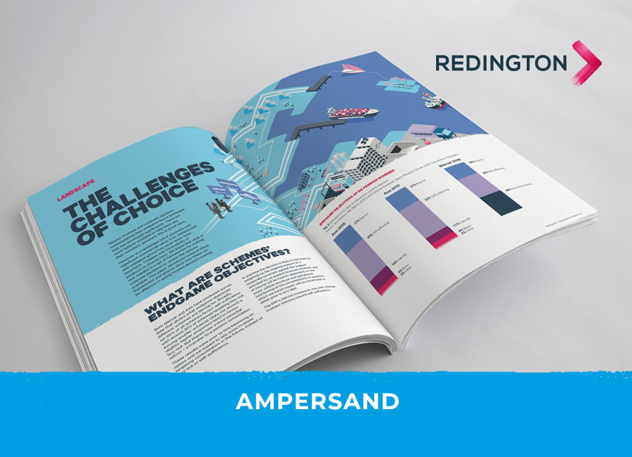
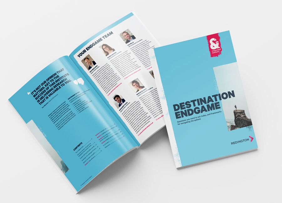
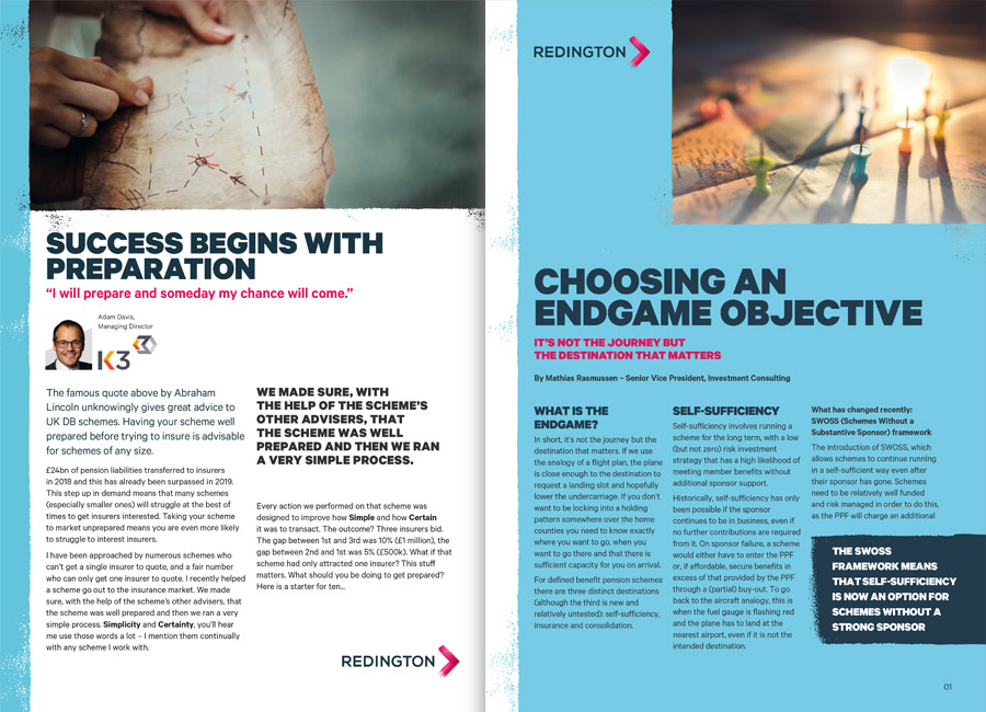
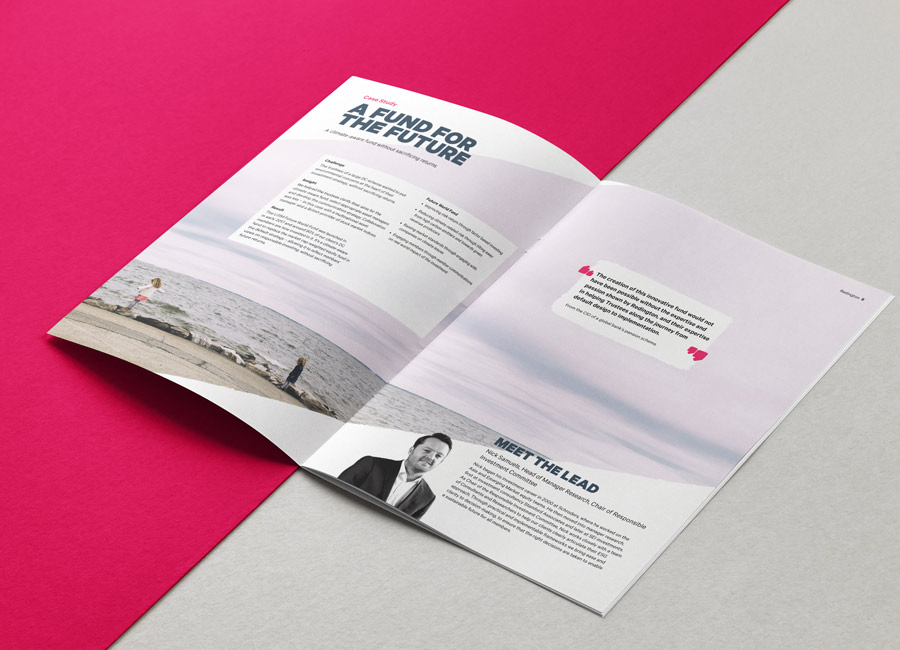
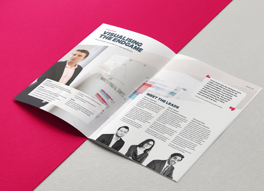
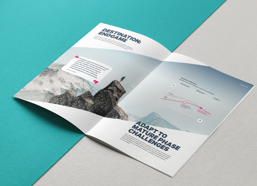
The Destination Endgame brochure was a great team effort. The design was established by the then Redington Creative Director, Nick Martin. I sourced photography, formatted the copy and designed the charts and diagrams.
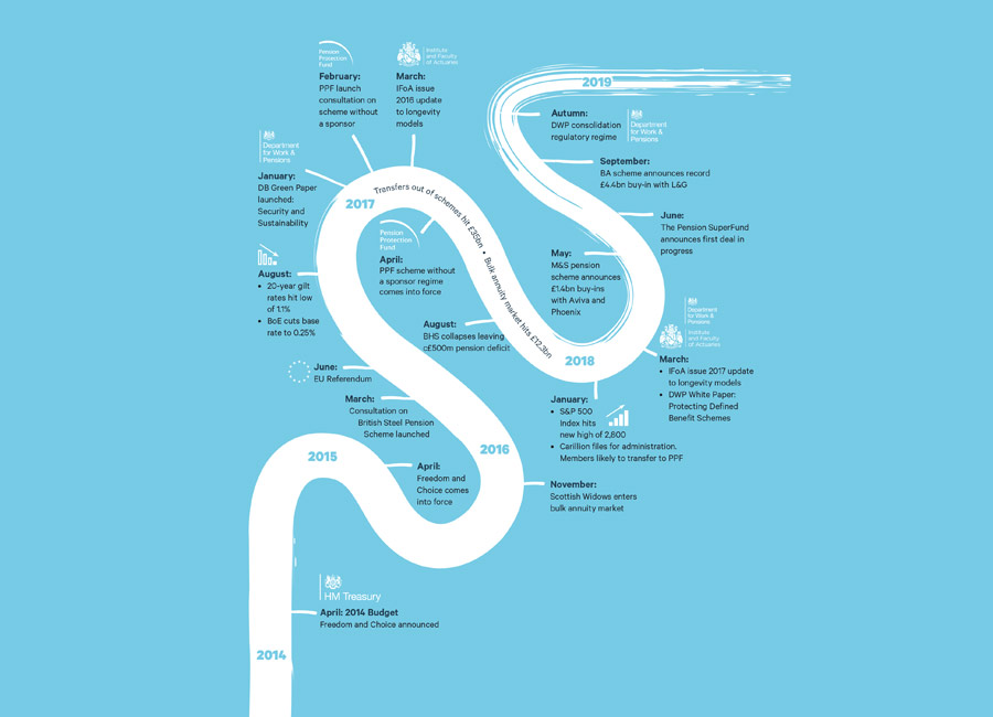
The most challenging part of this brochure was to create a visual giving a clear interpretation of all the options available to pension trustees whose schemes are approaching their endgame. The graphic needed to show the options as well as the route to these outcomes and the challenges they may face on the way.
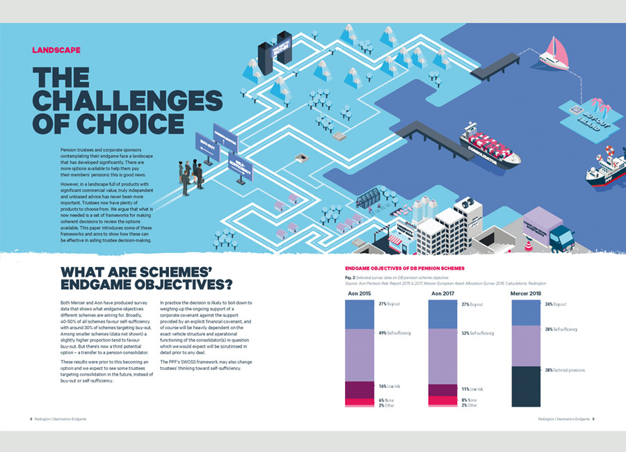
The brochure was well received externally and it spawned several follow up papers which I designed follwoing the same layout and visual identity.
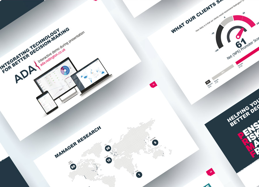
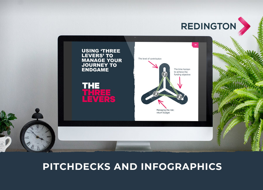
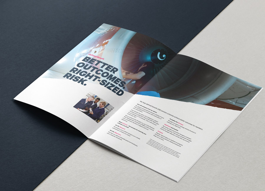
A big part of my second and third contracts with Redington were spent on evolving and improving the RFP (Request For Proposal) pitch decks used by the investment consultants. The final slide library would need long form and short form versions of many slides and had to include a variety of layout options to host a multitude of content.
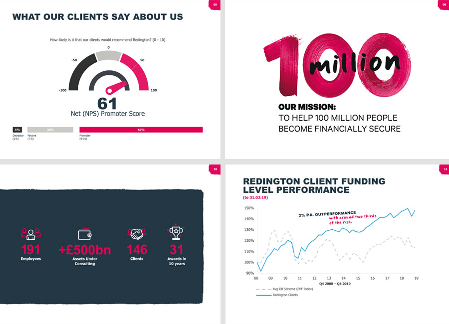
Part way through this project, COVID hit and everyone at Redington went from office-based to home-based working. Their business still continued and my new challange was to create a pitch deck that was fit for presenting to external companies in a very different way - instead of inperson, these important presentations will, for the foreseeable, be held on Zoom.
A team of Marketing people and writers worked hard on really stripping back the generic content and I worked on the design and layout so it be better suited to video presentation.
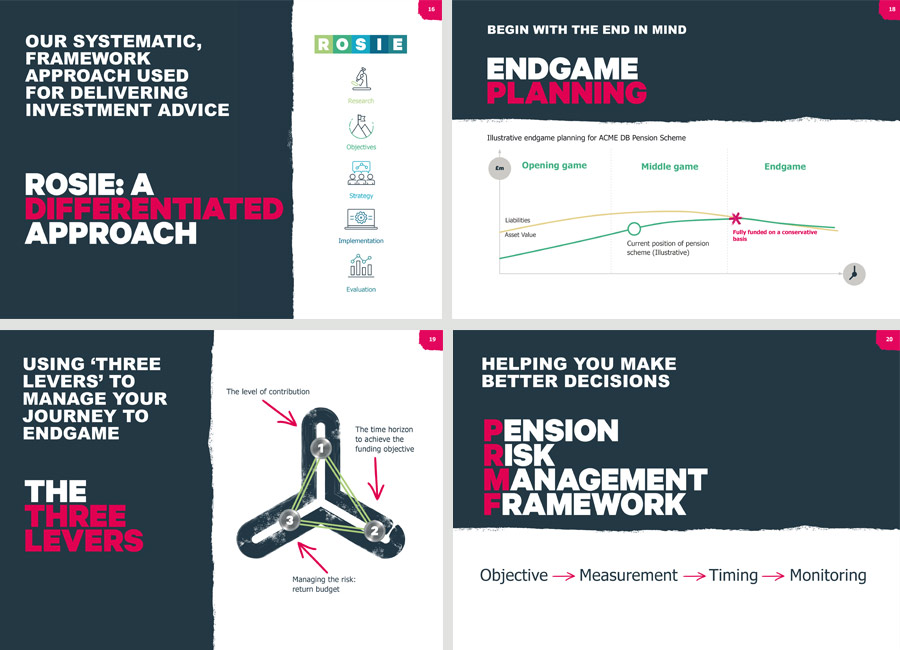
I designed the slides on a simple grid in InDesign and worked with a Microsoft guru within Redington to make the slide deck come alive in Powerpoint. With his genius macro skills and my art direction, the Redington team had an editable slide deck they could use and adapt to any new prospect.
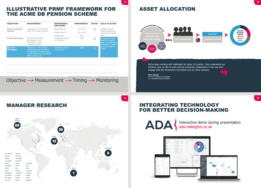
Below is an example of an infographic I created which summarised a huge amount of data around the UK defined benefit pension schemes. I had to draw out the key facts only and summarise these in way which told a complex story in a simple way.
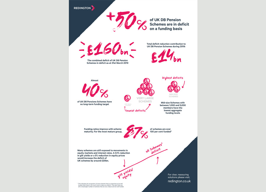
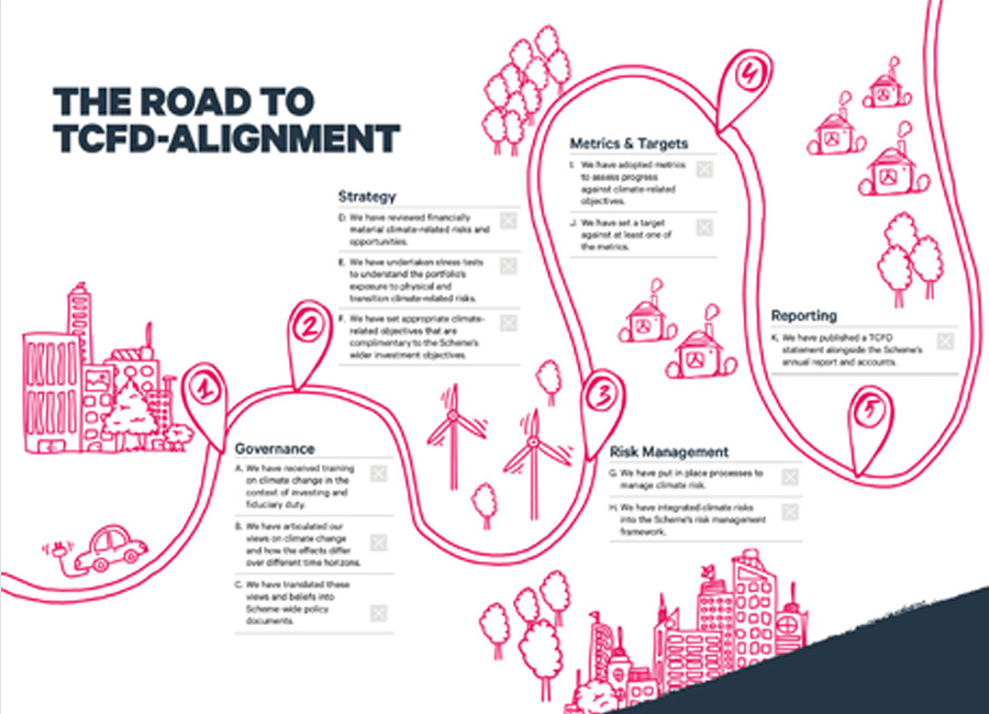
The Task Force on Climate-Related Financial Disclosures (‘TCFD’) developed a set of recommendations to help organisations better manage, and disclose, climate-related risks and opportunities. These recommendations were adopted by the Department for Work and Pensions in January 2021, with the issuance of draft legislation requiring large pension schemes to consider, and disclose, their climate-related financial risks and opportunities. Redington set out the road to aligning with TCFD recommendations for their clients, with the aim to provide clarity around what is needed from their pension schemes and when. I was tasked with creating a visual map to illustrate the journey and clearly depict what needed to be done and when.
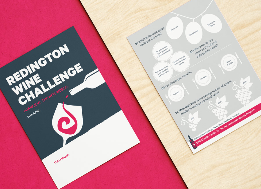
Redington hosted some brilliant events for their clients. Everything from webinars to wine tastings! The image below is part of a printed pad produced for one such event. We wanted to make the answer sheet for this quiz a little more interesting and interactive. The answers were all multiple choice and I illustrated the options so each team could colour-in their answer instead of writing it. I was informed that this worked brilliantly and was favoured over writing by the participants, especially as they got towards the end of the quiz after much wine tasting!
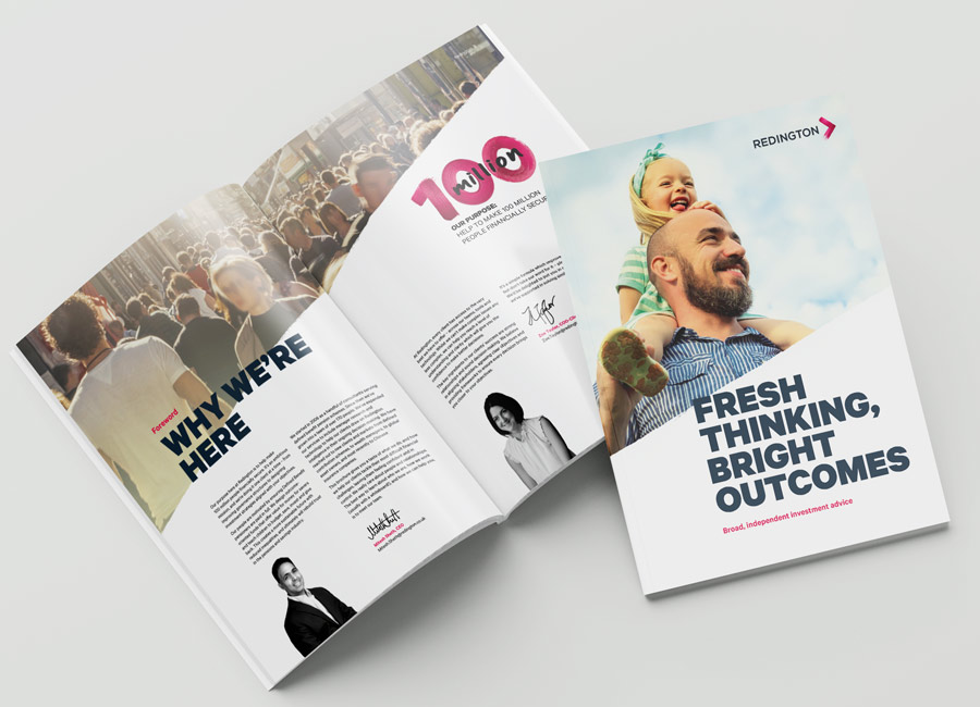
This brochure was the flagship sales tool for Redington for a while. My input was largely hunting for great images and artworking the copy and headers. This project was art directed by Nick Martin.
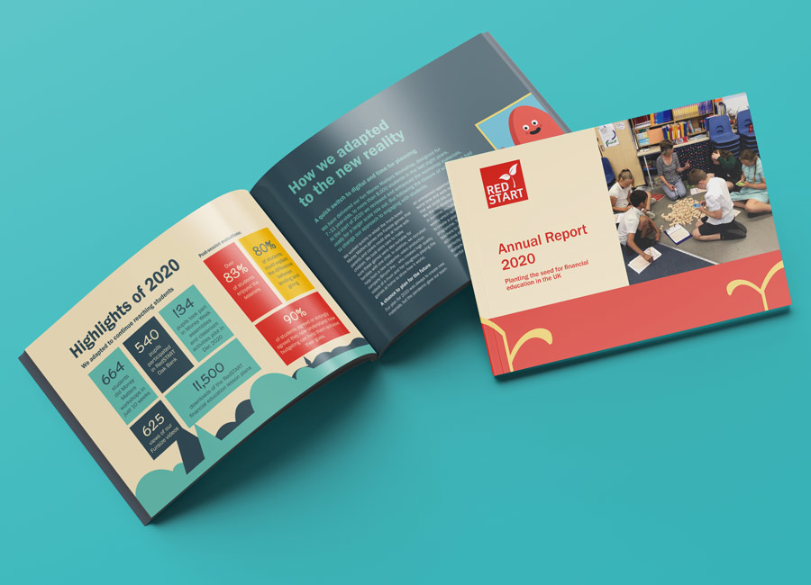
RedSTART’s goal is to put people in control of their finances. Giving them the skills they need to manage their financial futures from a young age. They work with young people from all backgrounds across the UK. RedSTART and their volunteers have developed a fully interactive financial education game for primary school students. Students learn key financial behaviours in a fun, engaging, game-based environment.
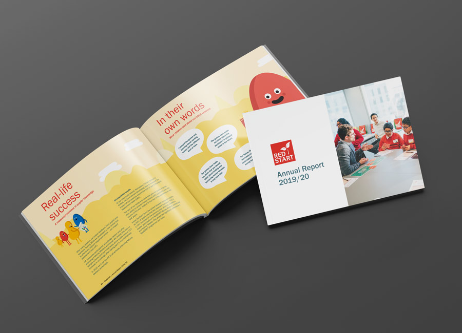
I was introduced to RedSTART whilst working for Redington. RedSTART are a financial charity started by the founders of Redington. For the last two years, I have done the artworking for their Annual Report and Accounts. The illustrative design already existed on their website. I was given all of these vector assets and created brochure spreads.
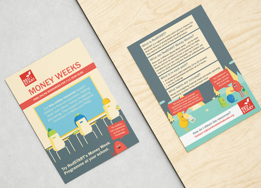
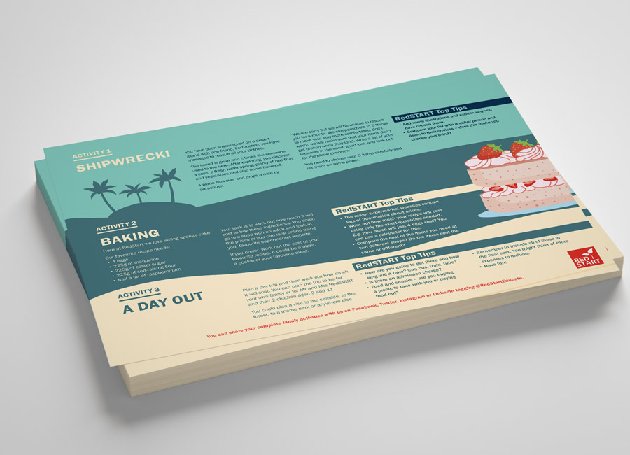
In addition to Annual Report work, RedSTART approached me last year when they took their usually in-class Money Weeks programme online, thanks to Covid. I worked on powerpoint slides to be used as backgrounds to video presentations as well as designing leaflets and activity flyers to promote these wonderful school classes.
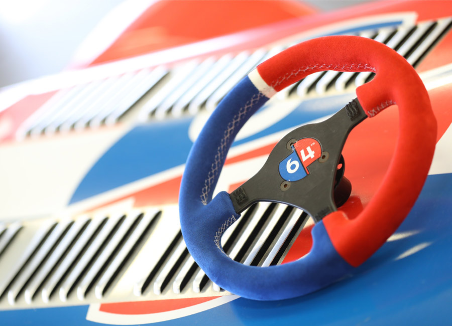
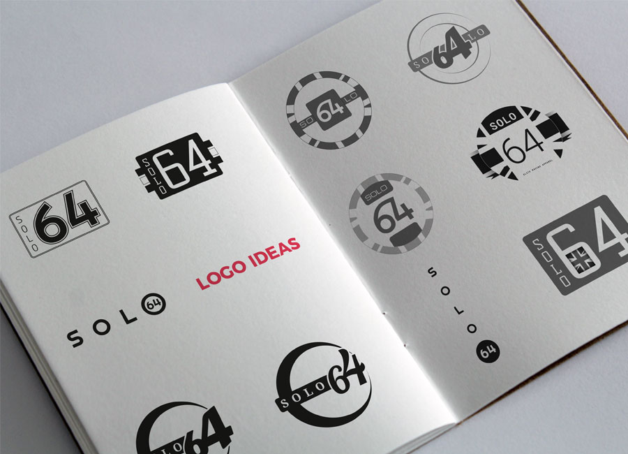
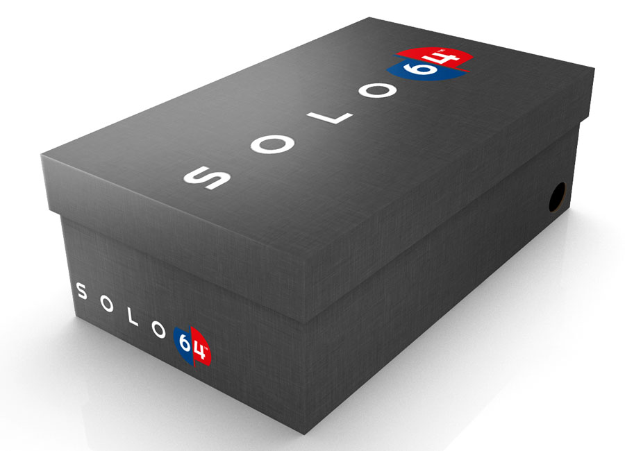
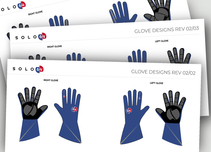
I loved working with Giuseppe to brand his racing apparel company. He is so passionate about his design, technology and making a world class product for elite drivers. His enthusiasm and excitement got ME excited about racing shoes! Giuseppe knew he wanted red, white and blue to promote this was a UK business. The design was left to me.
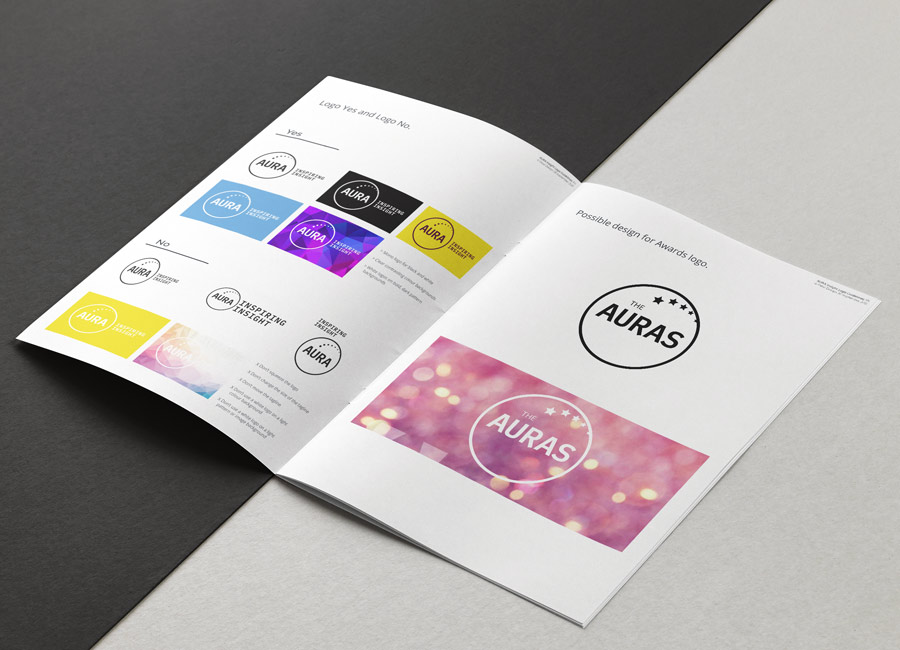
AURA is UK's biggest clientside research networking and events organisation, connecting professionals who want to improve their expertise and impact.
AURA approached me to pitch to them for the project of redesigning their logo. Delighted to have won, I worked with Bea Media Group and set to work on understanding what the organisation did, who they serviced, what their values were and why they do what they do. This was a very challenging project. They wanted something serious, modern, inspiring and clean.
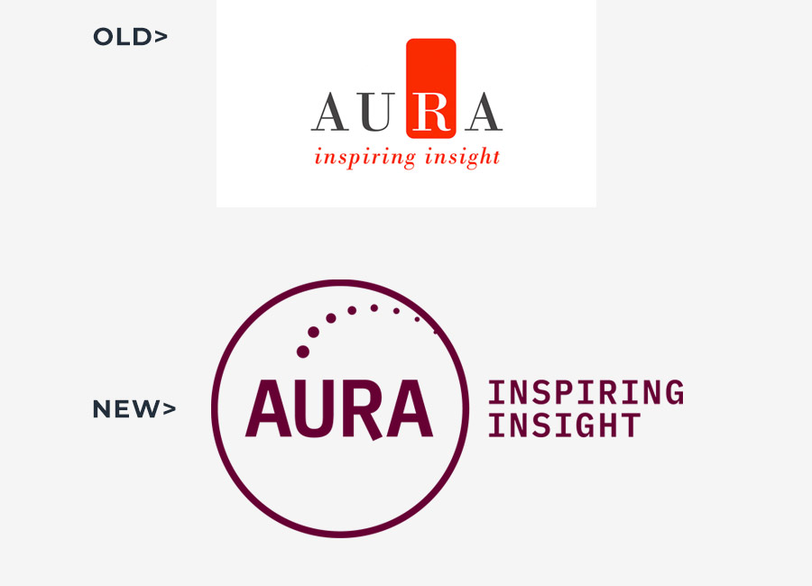
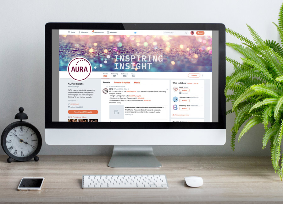
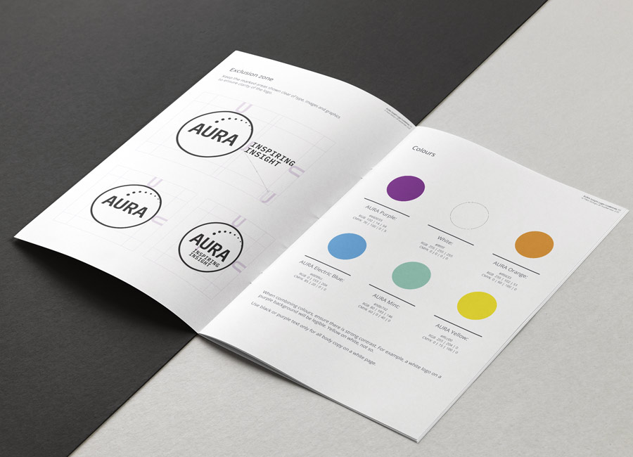
I supplied a full suite of new logos in brand colours with options for a lock-up including their strapline. I designed some sample pull-up stands and social media graphics and created a concise set of brand guideline to assist with keeping their new identity consistent yet scalable.
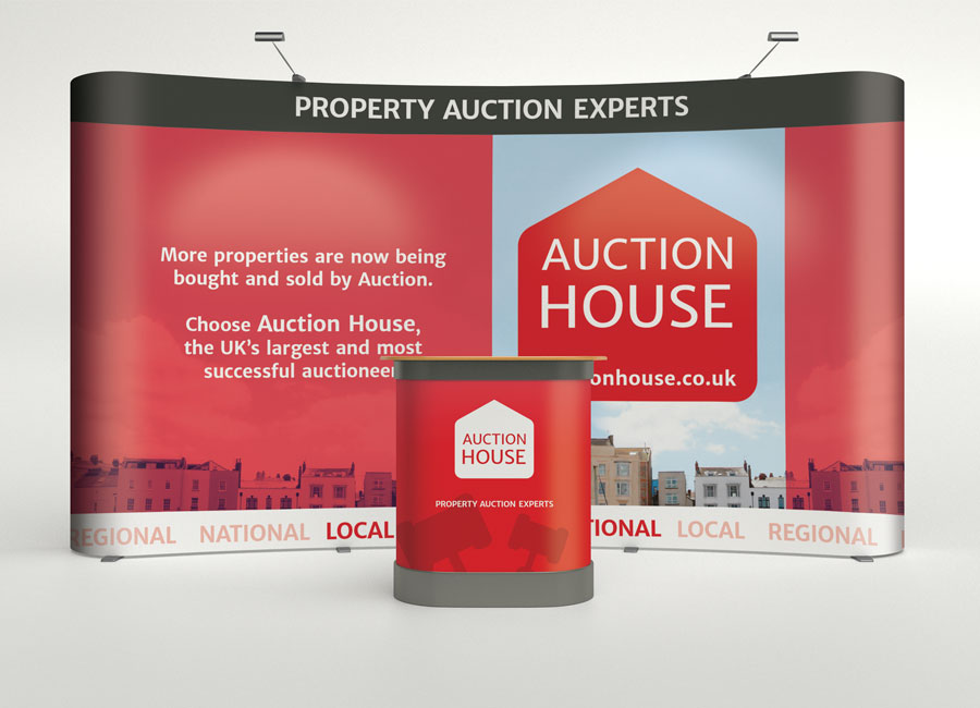
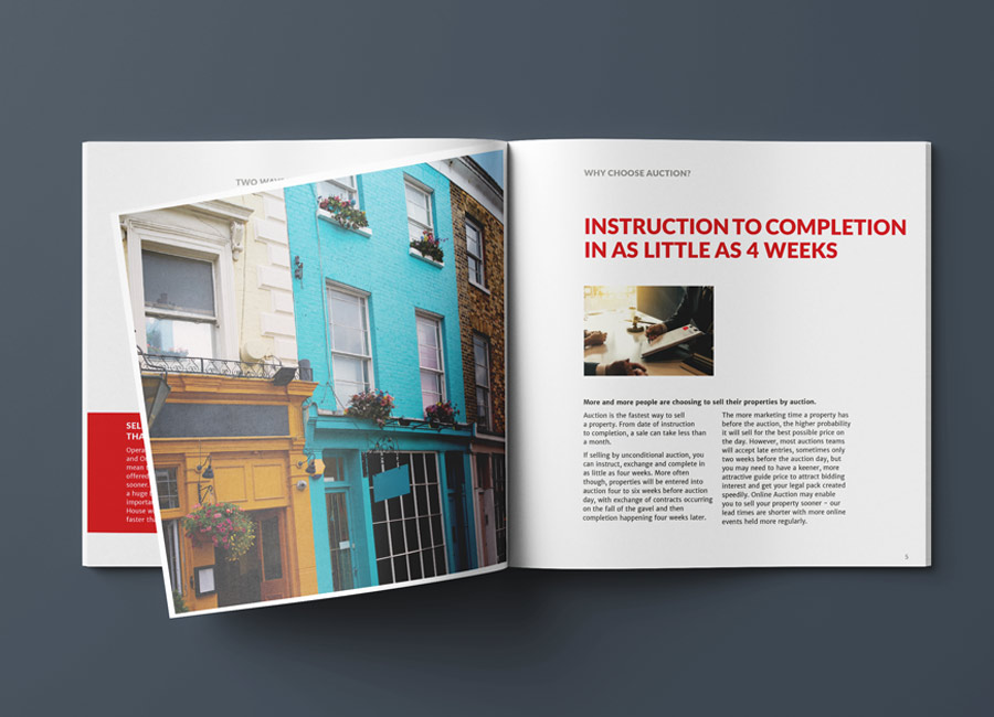
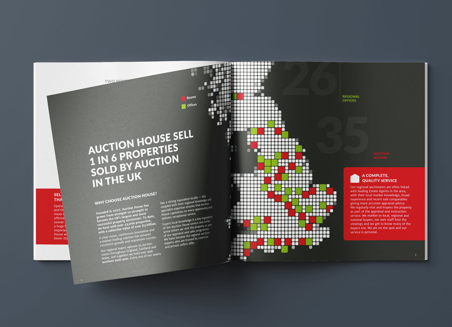
Auction House is the UK's number 1 property auction company. They have 40 auction rooms nationwide, holding in excess of 200 auctions and sell over 3,000 properties every year.
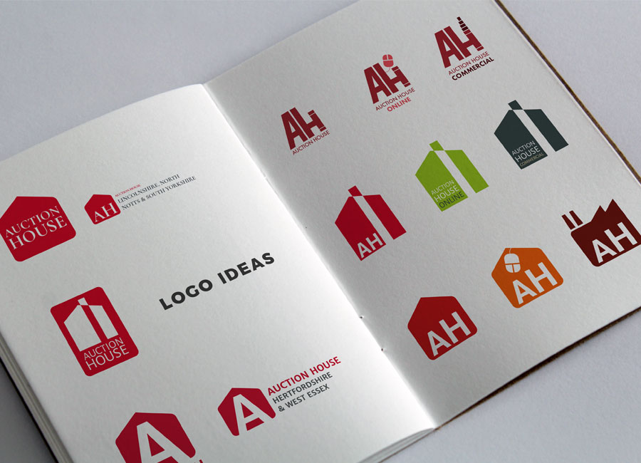
It was a pleasure working with Auction House UK's directors and sales and marketing teams. I helped give their beloved brand a little make over. Passionate about what they do and doing it honestly and efficiently, the team where after evolution and not revolution.
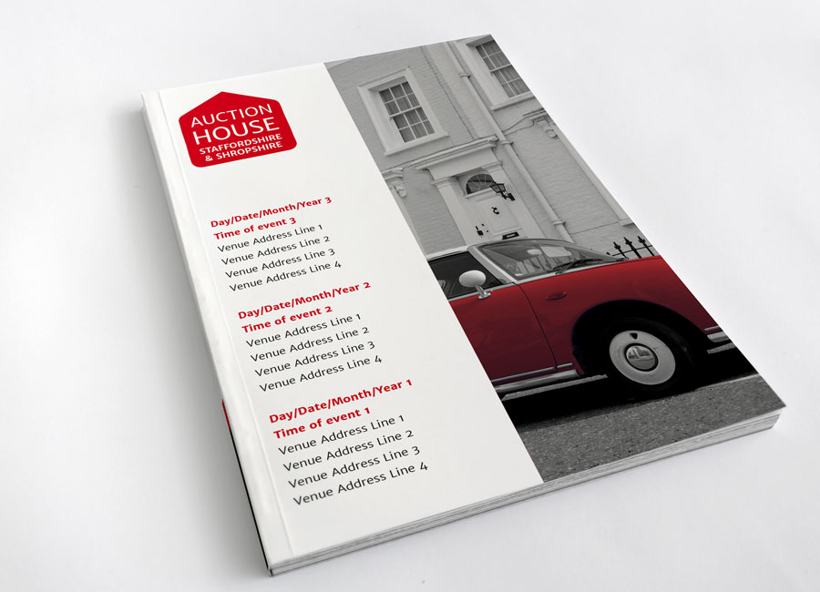
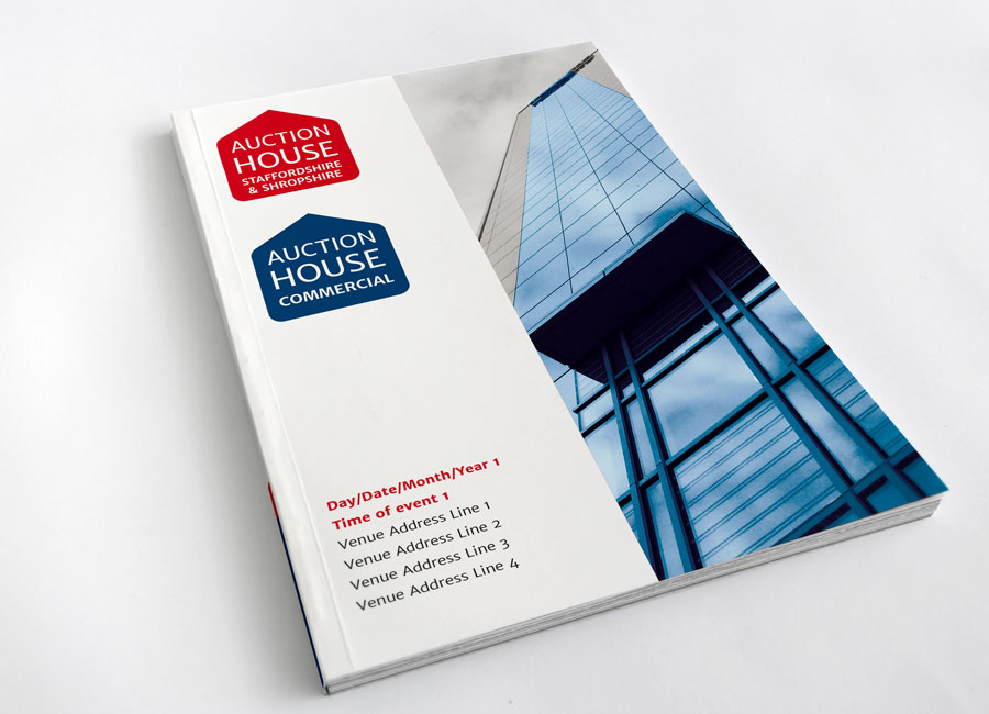
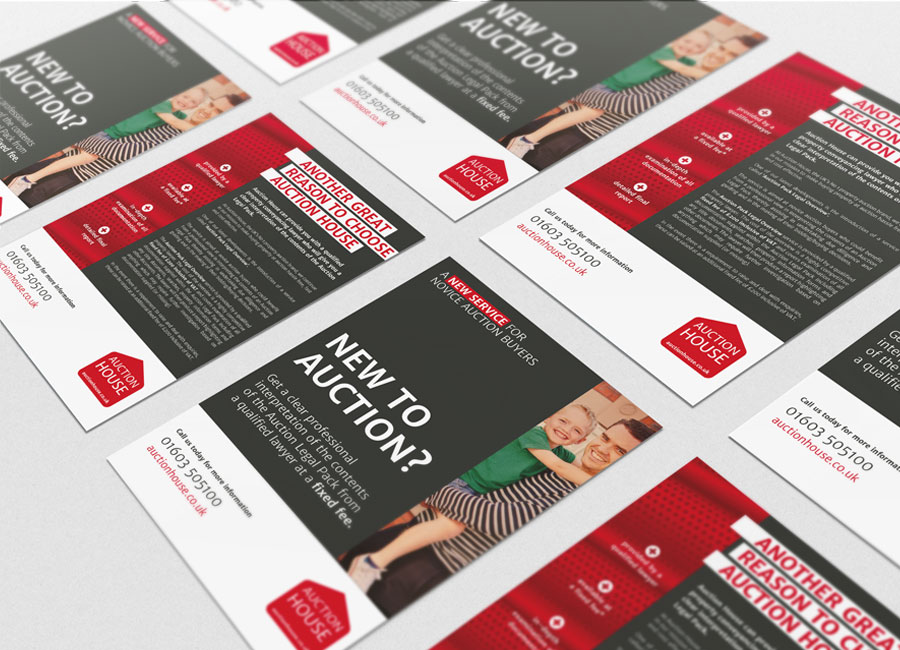
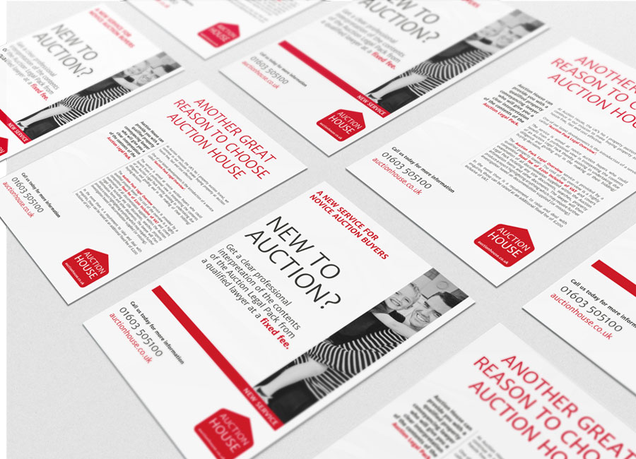
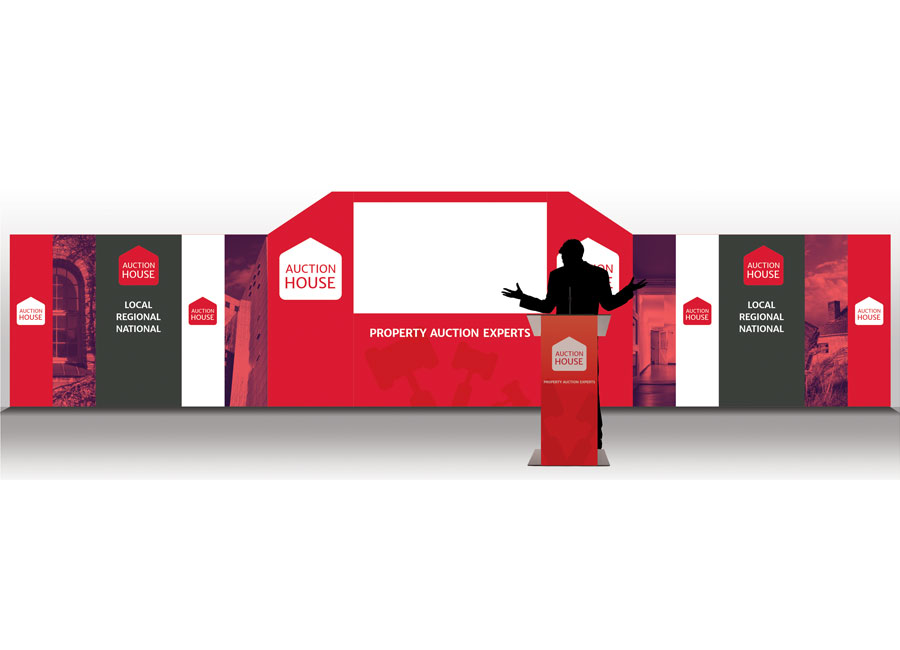
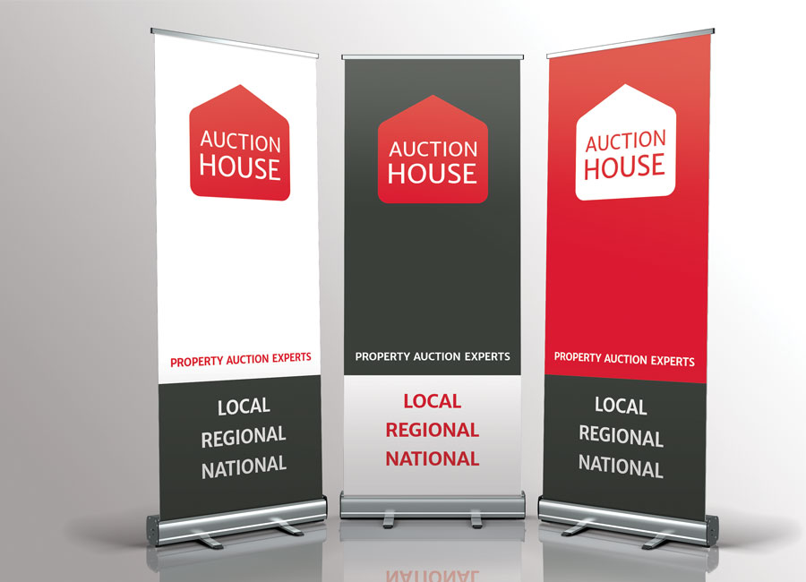
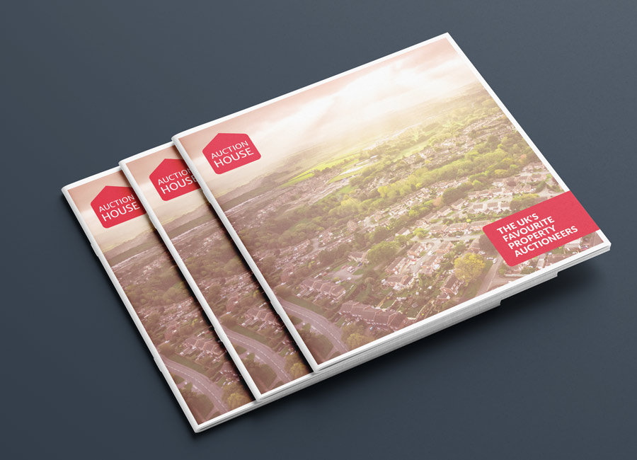
I designed their new staging, pop up and pull up stands as well as templates for brochure covers and leaflets. We experimented extensively with photography and I created a soft red duotone to bring some consistency to the staging graphics.
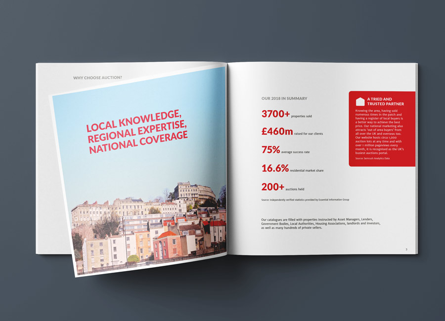
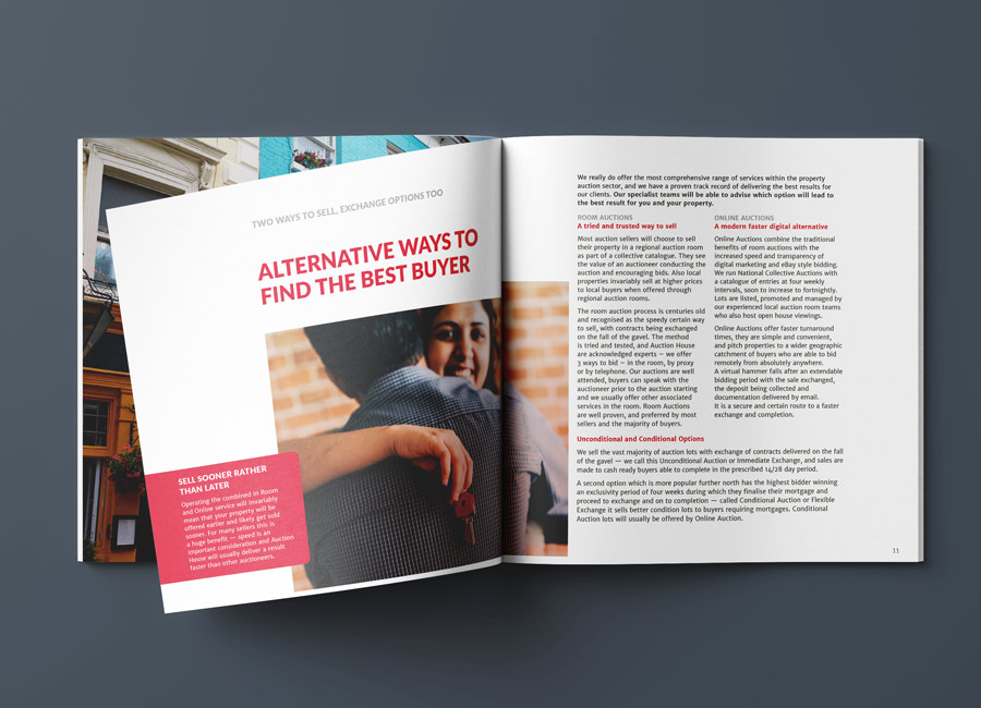
The following year, Auction House returned and we worked together to produce their coffee table book. I art directed, designed and assisted with copy writing to make their page headings more impactful.
Rhubarb Hospitality Collection (RHC) is an international premium hospitality group with the unique capability of executing multiple food and beverage disciplines under one roof. I have freelanced for Rhubarb both onsite and offsite for a few years. I love working with the designers and marketing team at their London office. They have a great, positive energy and are extremley welcoming. They have a strong team ethic and their creativity knows no limits.
I was very proud to work on projects for Goodwood, the Royal Albert Hall, Sky Garden, ViVi and Rhubarb in-house materials too. My role was mainly artworking with a little logo design and in later months, email design and HTML development.
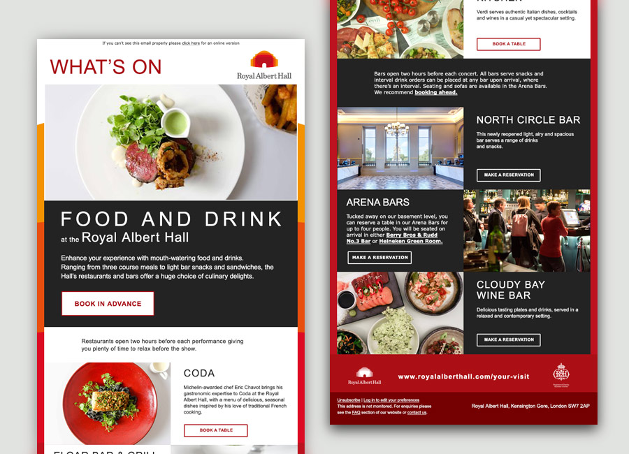
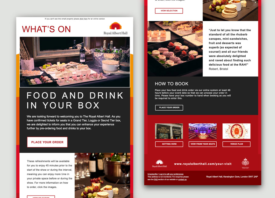
Rhubarb wanted to smarten up their eComms to customers of the Royal Albert Hall (RAH). I designed several layouts for a newsletter to send to RAH event ticket holders advertising their options for food and drink once at the venue. I designed the emails to be fully responsive and usable on mobile devices as well as desktop computers. I coded the final design in HTML and worked with a third party platform who scheduled and managed the email sends.
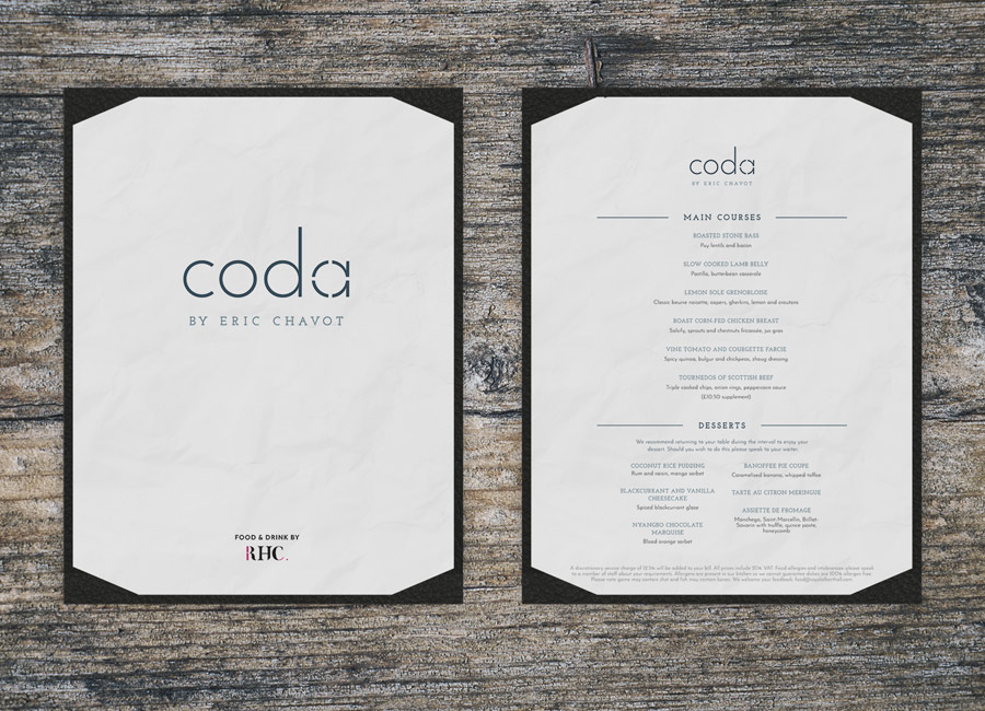
I had the pleasure of designing a logo and menu for a new restaurant at the Royal Albert Hall. Headed up Michelin-awarded chef, Eric Chavot, Coda's identity needed to be high end, elegant and sophisticated.
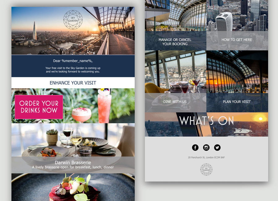
The Rhubarb team deliver a range of luxury dining options to Sky Garden — a spectacular three-floor event venue and rooftop restaurant and bar. Set above 20 Fenchurch Street in The City of London, Sky Garden hosts two of London’s most exclusive rooftop bars, Sky Pod Bar and City Garden and is also home to Fenchurch Restaurant and Darwin Brasserie.
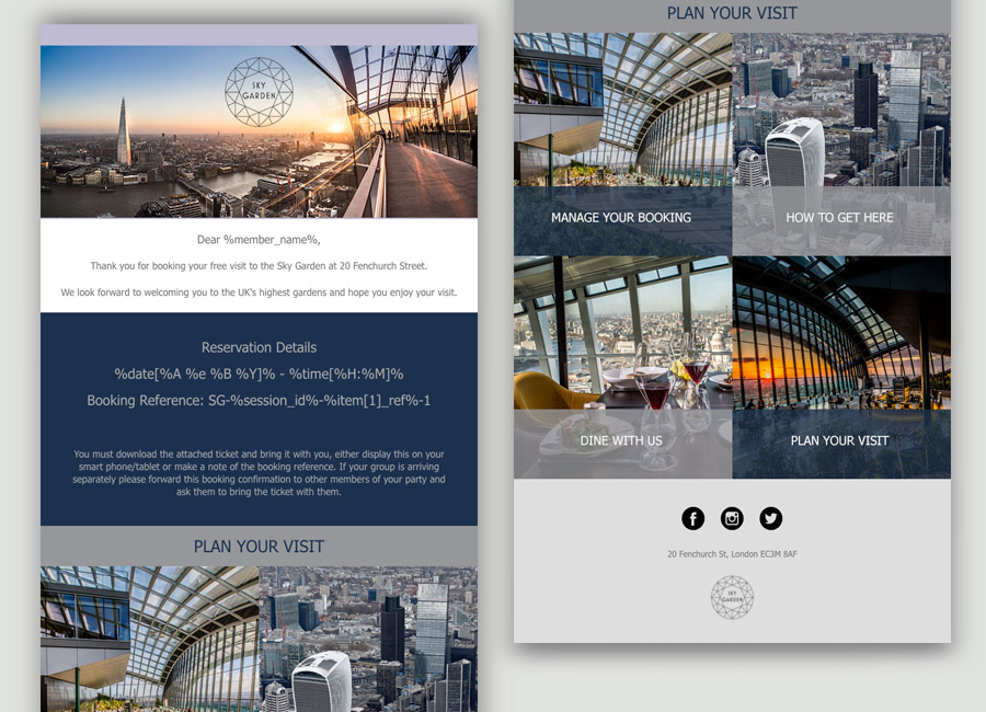
With a wonderful selection of bars, restaurants and activities at this iconic location, Rhubarb needed to communicate all of these offerings to ticket holders. I designed and developed a suite of emails including reservation, cancellation, ticket and reminder communications. I coded these emails with variable fields so they can be personalised to recipients at the point of sending by a third party company.
Realife Tech deliver mobile ordering, digital ticketing and personalisation solutions through mobile apps or SDKs (Software Development Kits). Some of the world's biggest arenas use their tech, including the Barclaycard arena, Edgbaston, Lords cricket ground Tottenham Hotspur, the O2, Mercedes-Benz arena, the SSE Arenas in both Belfast and at Wembley and LA Galaxy.
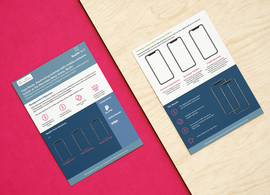
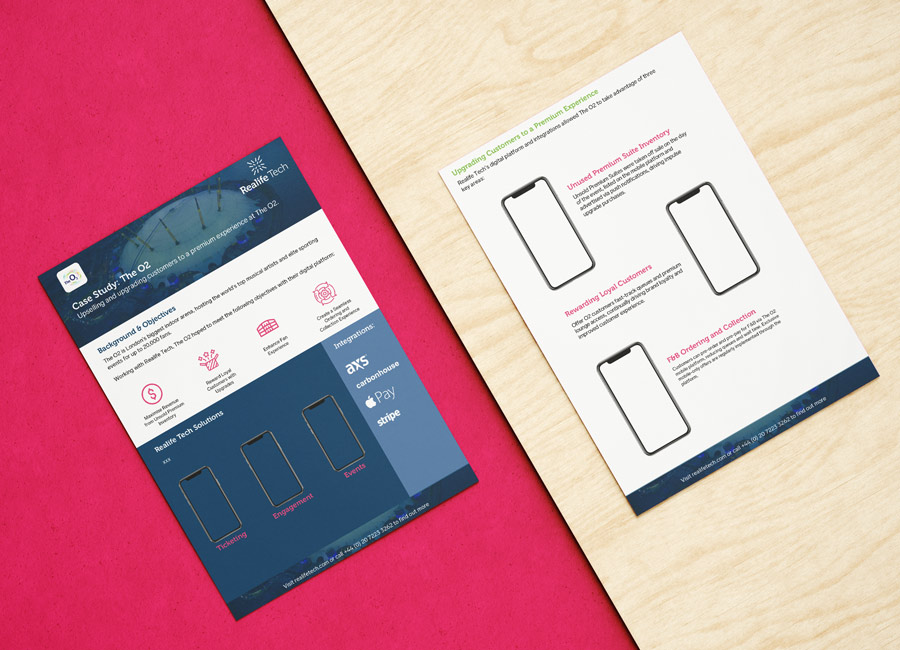
Realife Tech have a strong visual identity already in place. They had recently been through a re-brand and called on me to take their new powerpoint template for case studies and create several variations for further case studies. I sourced some icons and adjusted the layout to suit the length of content supplied.
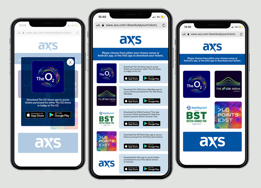
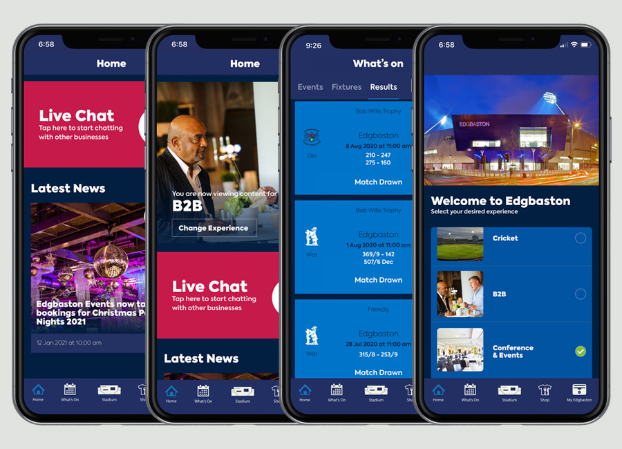
Another service I provide to Realife Tech is creating graphics for some of their pitches. I always receive a tight brief with specific art direction and I simply create visual images to match their requirements.
K. M. Dastur is a leading, independent, professional services firm providing insurance broking and risk advisory solutions worldwide. They provide personalised insurance solutions for a broad range of businesses, professional and financial institutions, private clients and membership organisations.
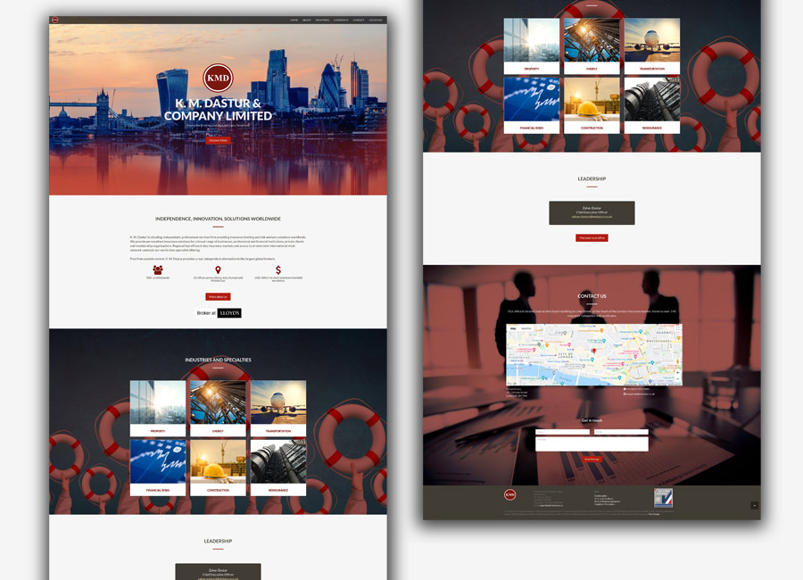
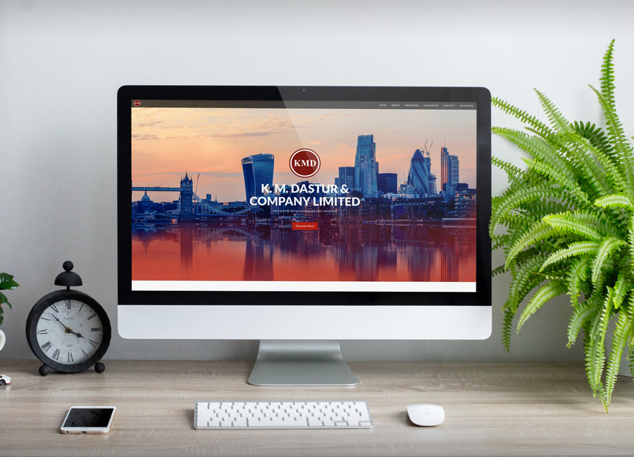
I was approached by KMD and asked to design and build them a simple website for the UK arm of their business. I reviewed other websites in their sector and created some simple UI elements based on the existing colours and fonts. I presented KMD with several design options for a parallax scrolling website and on receipt of their copy, I created a wireframe for the site and designed a version of the website in Adobe XD.
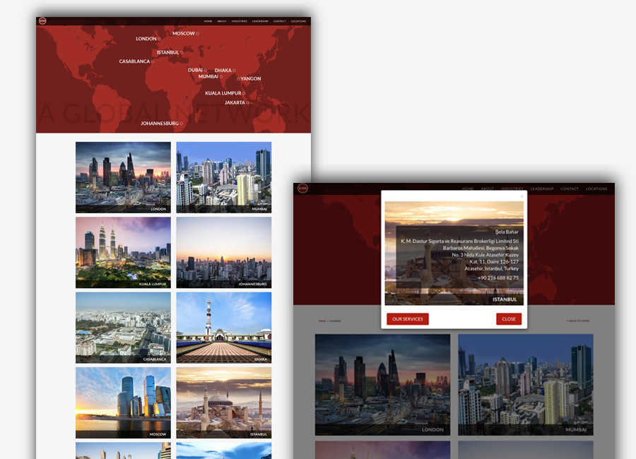
Once the design was approved, I worked with a Bootstrap template and started building the homepage. There were many, many technical challenges I met on the way, not least creating an interactive location map of the KMD offices worldwide. I created a world map image at the head of the page and then had to make each dot active so that when you hover and tap on a location dot, an address card overlays the page.
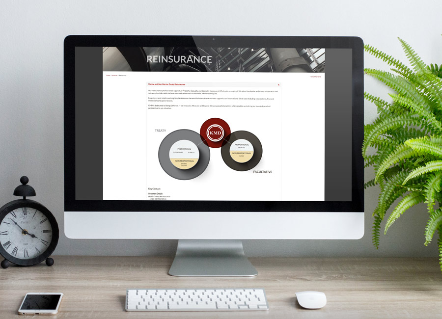
I continue to manage the content for the wesbite and update the content whenever KMD require a change.
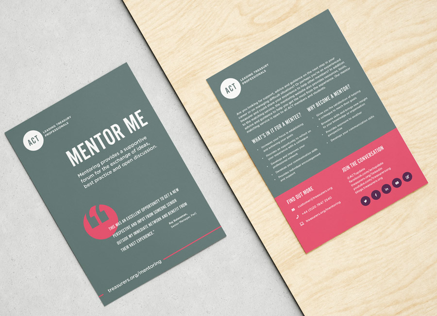
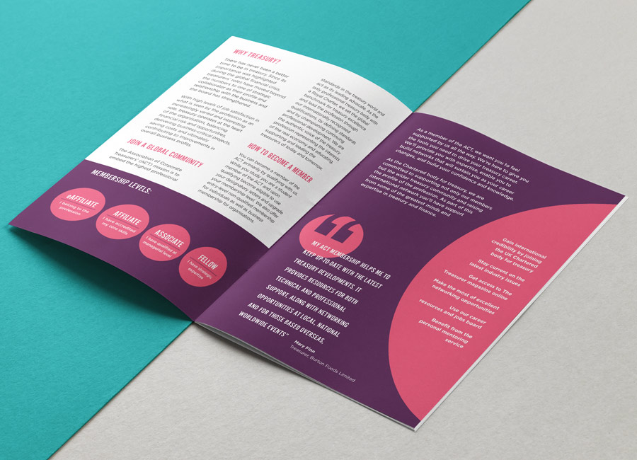
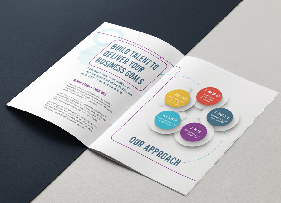
The Association of Corporate Treasurers (ACT) is the only professional treasury body with a Royal Charter. They set the global benchmark for treasury excellence and lead the profession through their internationally recognised qualifications, by defining standards and by championing continuing professional development. The ACT are the authentic voice of the treasury profession representing the interests of the real economy and educating, supporting and leading the treasurers of today and tomorrow.
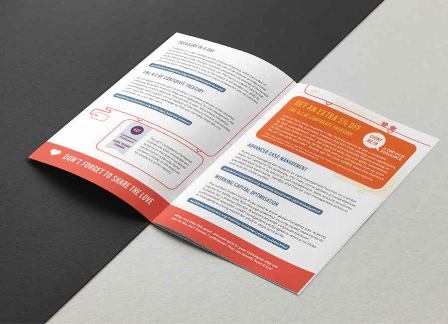
The ACT apporached me to produce a series of 12 A5 leaflets for printing and distributing at a conference. Following their excellent and concise brand guidelines, I created a grid-based template for both 4pp and 2pp options and then typeset each flyer using Word copy supplied. I created a variety of layouts and some graphic assets such as diagrams and a specific method of displaying quotations.
Incorporated in January 2019, Samson Rock Capital LLP is a London based, alternative investment management firm dedicated to equity event driven investing. Samson Rock seeks to deliver superior returns for investors coupled with tight risk management and an institutional quality infrastructure.
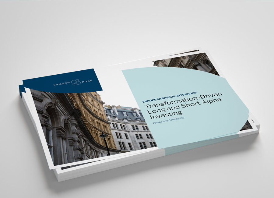
Samson Rock approached me to discuss some professional branding for their company. They wanted their visual identity to better reflect the professional sevice they offer their clients
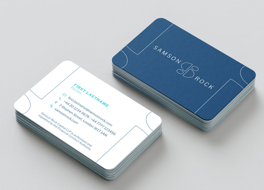
Simplicity and elegance were valued when it came to logo design. Four shapes arranged to represent an S – the four partners of Samson Rock. They are stones (solid) which create a symmetrical (reliable) path with a strong and connected mission (assured).
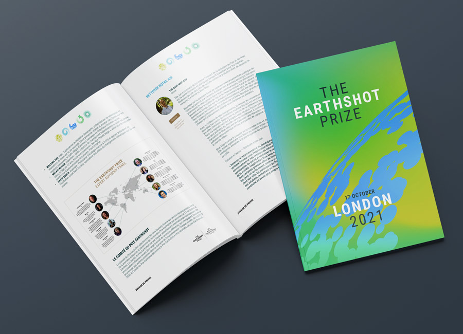
Currently being run by The Royal Foundation of The Duke and Duchess of Cambridge until the end of 2021, The Earthshot Prize is the most prestigious global environment prize in history, designed to incentivise change and help repair our planet over the next ten years. The Prize aims to turn the current pessimism surrounding environmental issues into optimism, by highlighting the ability of human ingenuity to bring about change, and inspiring collective action.
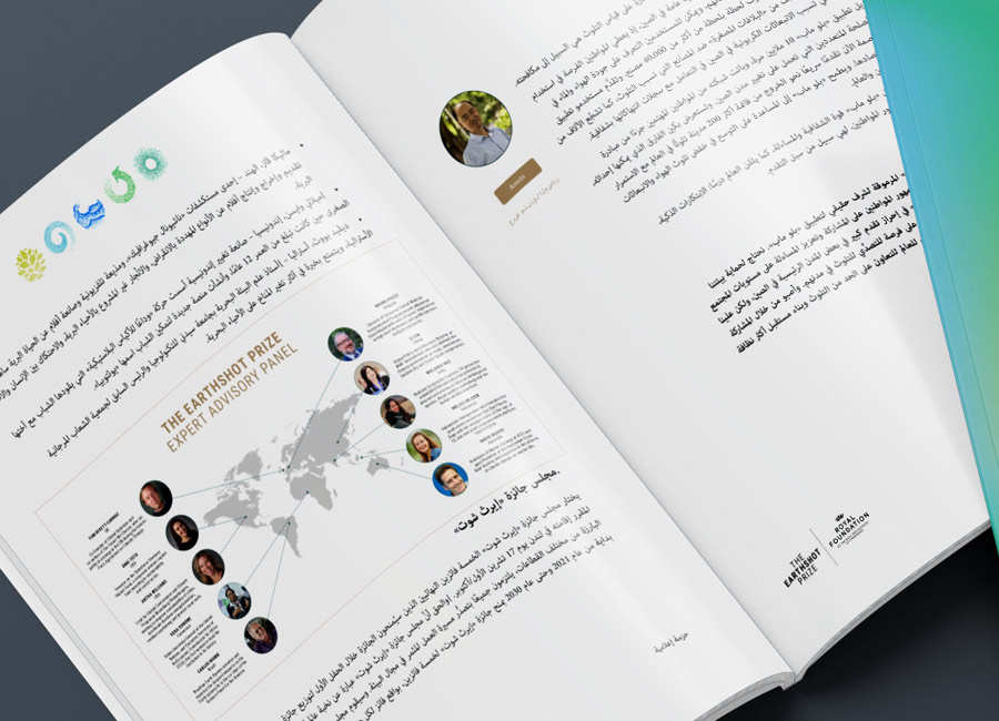
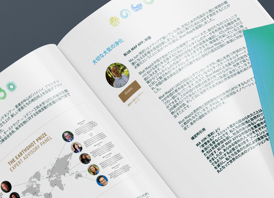
I was called on by the Earthshot team to create eight versions of a Media Pack, designed by the folks at North. The Earthshot team had Word documents in eight different languages and needed these to look like their beautifully designed English brochure.
I was supplied all of the design assets and the 27pp InDesign template file as well as the translated text. With very short notice, I worked through the night to meet their next-day Press deadline to announce their first-ever Prize Finalists, using the Media Pack as a key asset. I was very proud to play a small part in their inspiring journey.
Lesley Salem is on a mission to remove the muddle and stigma out of menopause for individuals and organisations. She set up Over The Bloody Moon (OTBM) to address a gap she noticed with her own perimenopausal journey. A self-confessed research geek, nothing makes Lesley happier than providing emotional and practical menopause support, for individuals and organisations. Lesley is a certified integrated health coach and, teaming up with other specialists in the field, they have carefully curated accurate, trusted information which Over The Bloody Moon can now share with you!
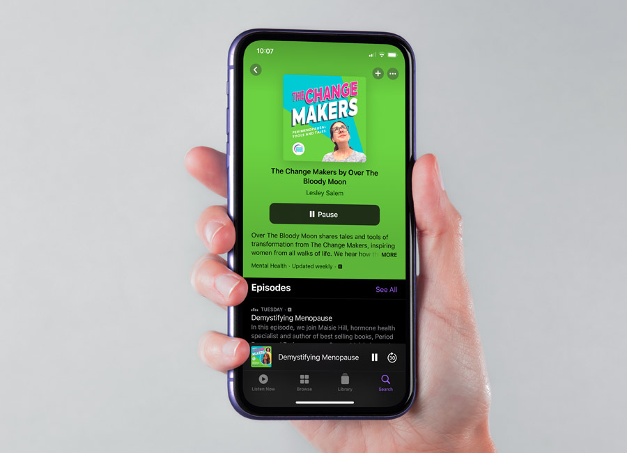
I have loved working with Lesley at OTBM. She first contacted me to ask for a design for her new podcast. OTBM had a logo and some very bright brand colours. The layout and design was left to me.
We then started to evolve the visual identity. I added a couple of fonts - one for display and one for copy - some graphic elements and I started work on some templates for presentation slides.
I then started work on creating a suite of workbooks for Lesley to present at seminars and send out to client. It was important that the photography I sourced show a diverse mix of women, not just in age but culture, race and ability too.
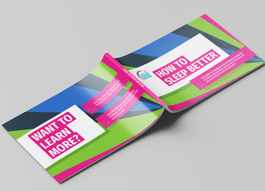
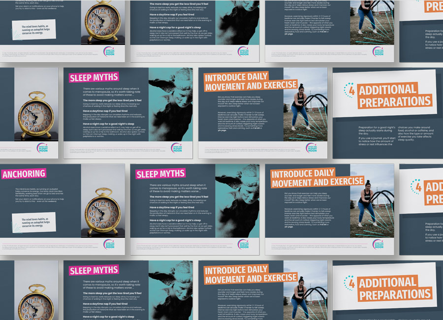
To be used alongside these workbook, I developed Lesley's worksheets into branded, interactive PDFs.
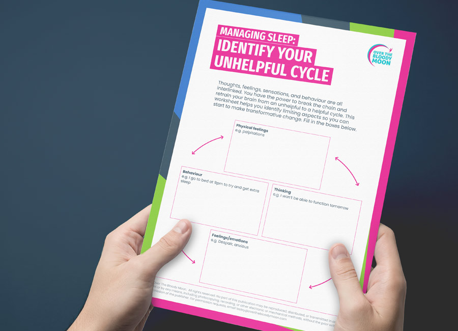
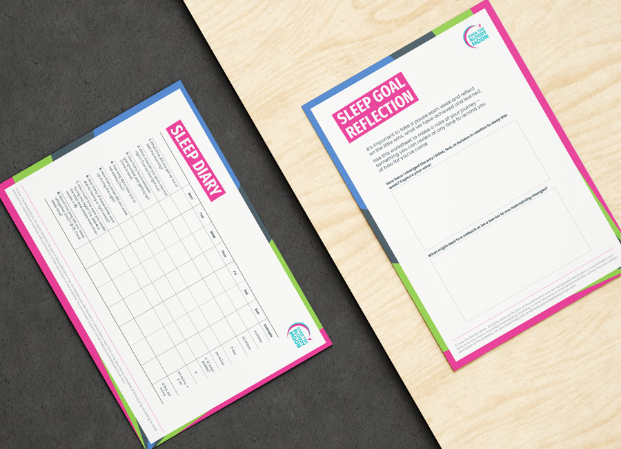
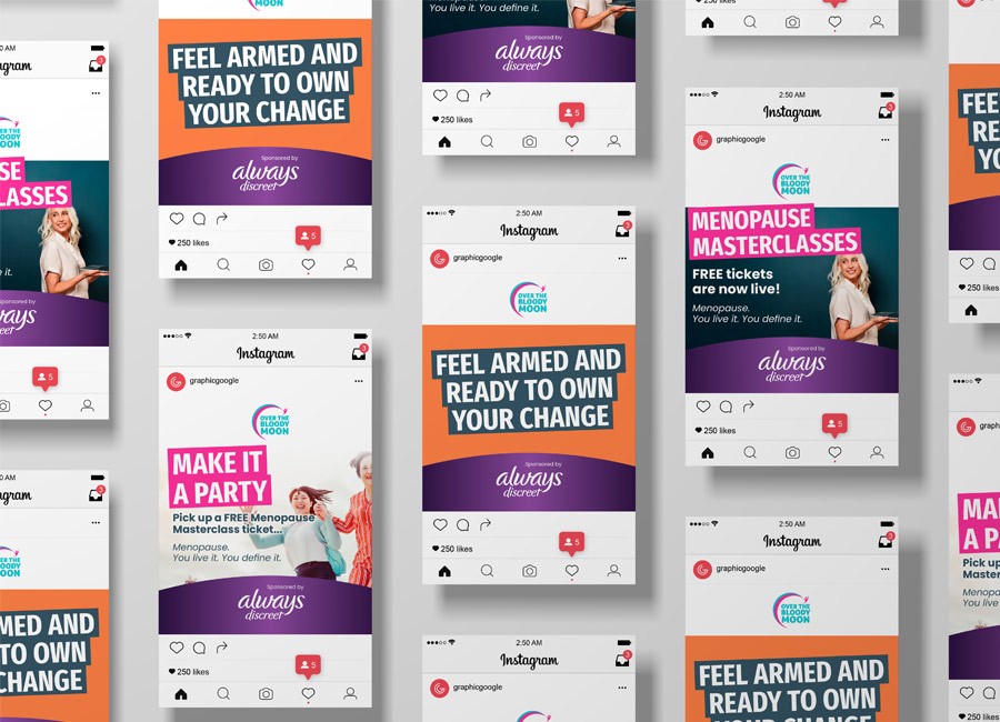
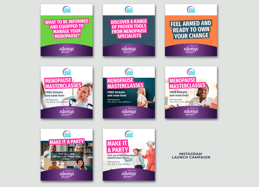
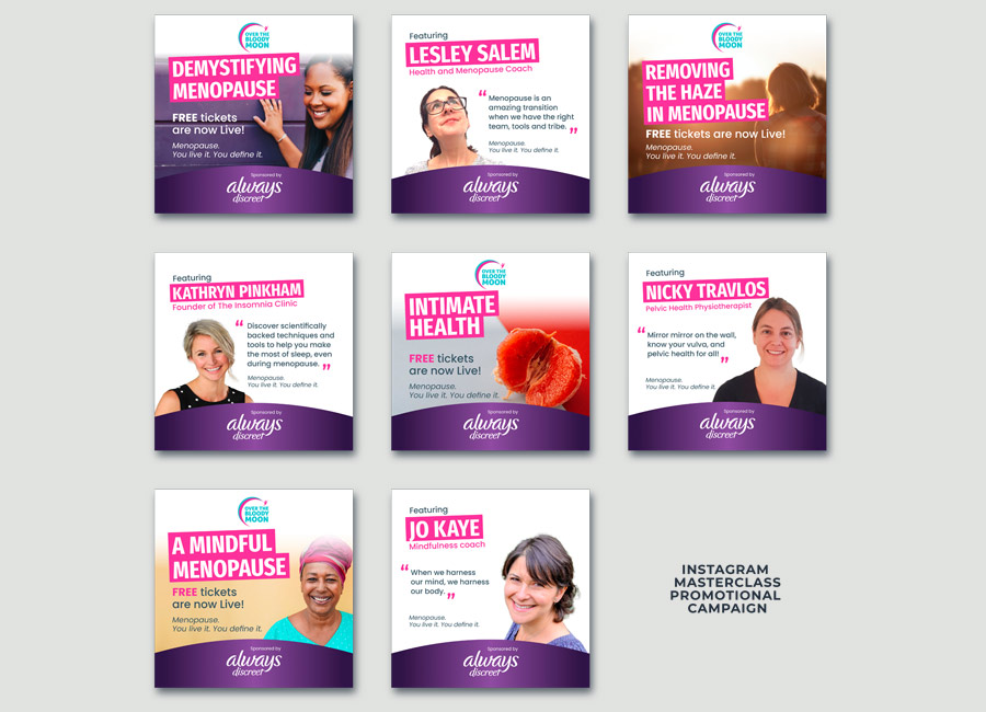
Most recently, I worked with Lesley on designing social media banners to promote some free online workshops. This campagin was sponsored by Always Discreet so it was a great opportunity for OTBM to get noticed as a force for good for women everywhere. Once the design of the banners was agreed, I created many more to be used across Instagram stories and posts, Facebook and various websites.
It was a privilege to work at Rightmove for seven years. I loved every minute.
Rightmove is the UK's number one property portal. Their aim is to empower the UK's decisions around property. Rightmove's sophisticated, yet simple, property search platform makes it easy for home hunters to find their 'happy'.
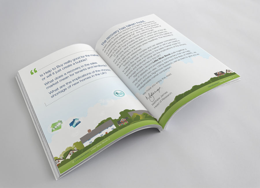
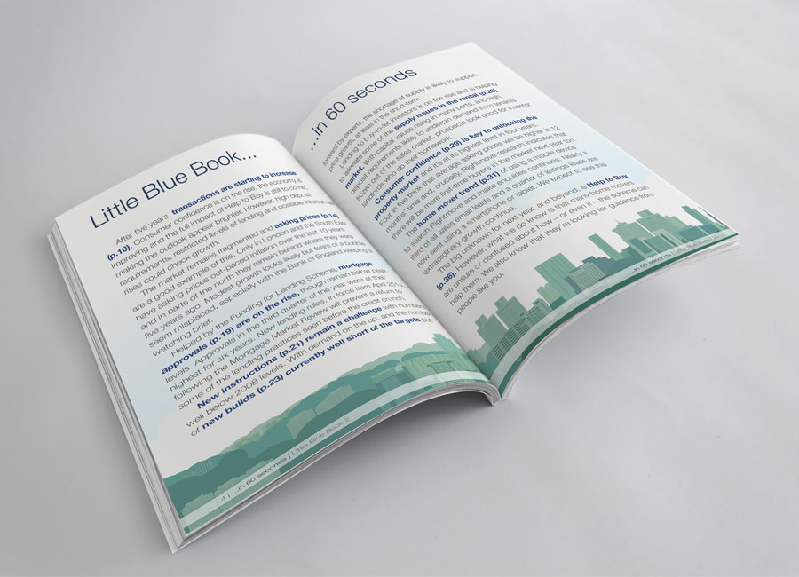
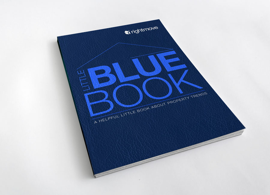
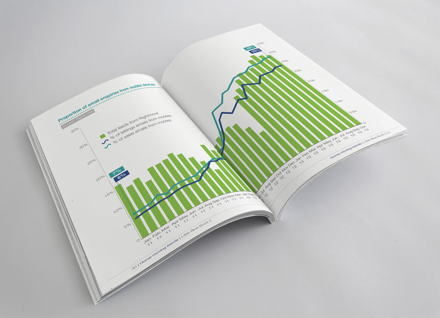
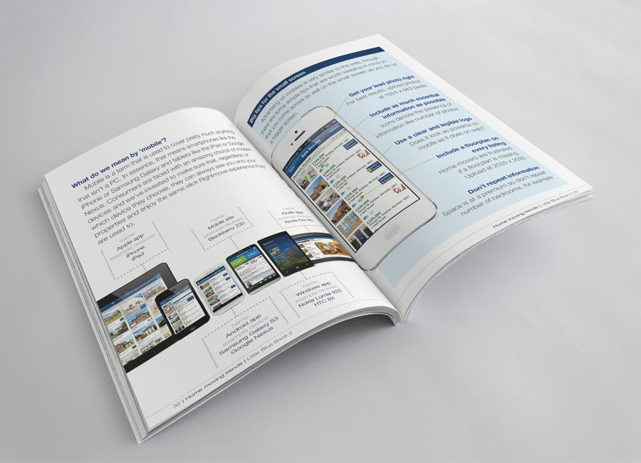
One of my most challenging projects was The Little Blue Book. Our marketing team had been tasked to provide a compendium of property information to all of our customers (agents). In the world of property buying and selling, data is a powerful tool used by all in the industry. At Rightmove, we had a huge amount of data on the property market nationally, regionally and locally. How could we package the most useful data in a way that was useful to share?
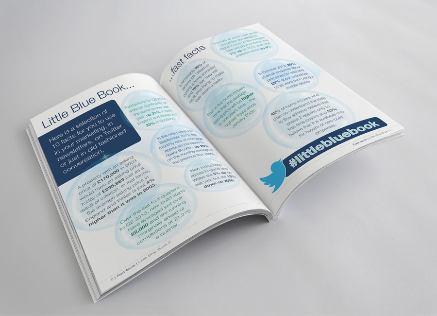
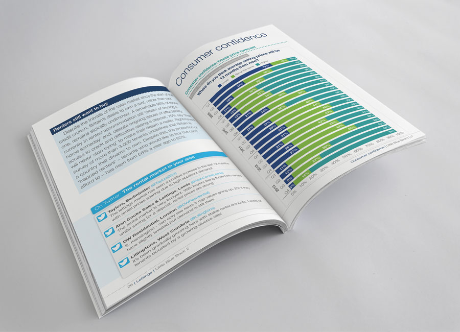
I made the book 7" x 5" to break for the standard A4 and to give the compendium more of a book feel. I wanted it to live on shelves or on desks and be used a reference guide by agents when in meetings with prospects. I searched for a quality board to print on and chose an Antalis uncoated woven white stock. The cover was rubber lamented to connect touch with the look of the leather texture used in the design.
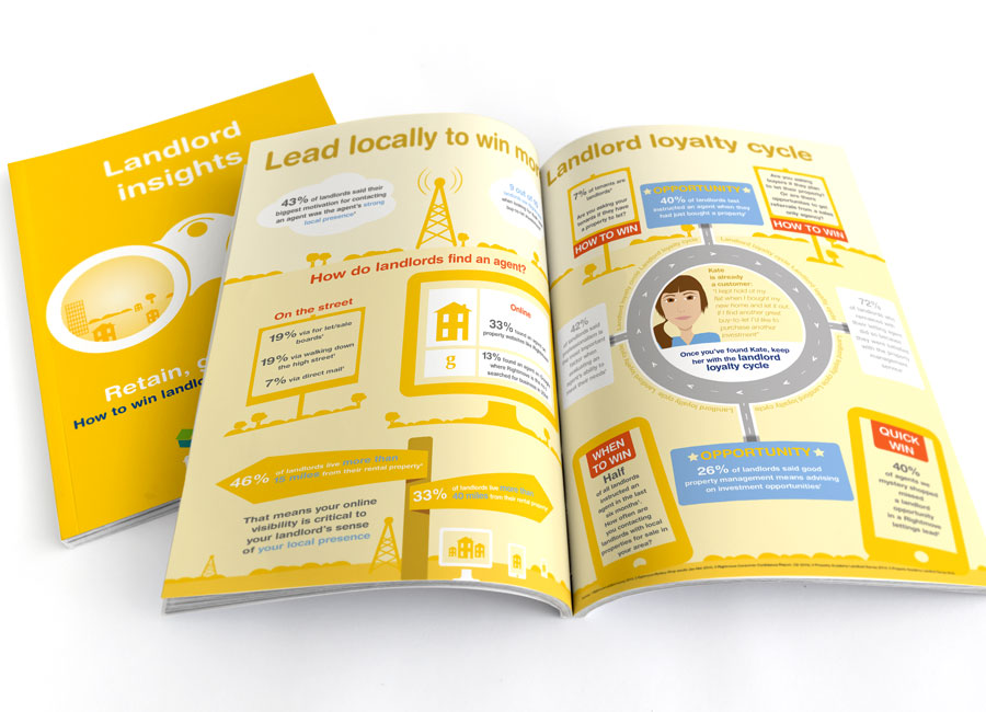
I WISH I had saved the piece of paper I was presented with as my brief for the Landlords Insights brochure. It was a sheet of A4 with biro marks - circles, lines, short paragraphs of scrappy text. The text described a very complicated method of how lettings agents could gain custom from the tenants of their landlords. Estate Agents do not read lengthy emails or long passages of printed text, no matter how much it may help to bring them extra business. My mission was to turn the marketeers biro'd thoughts into a visually appealing spread of bitesize facts and figures.
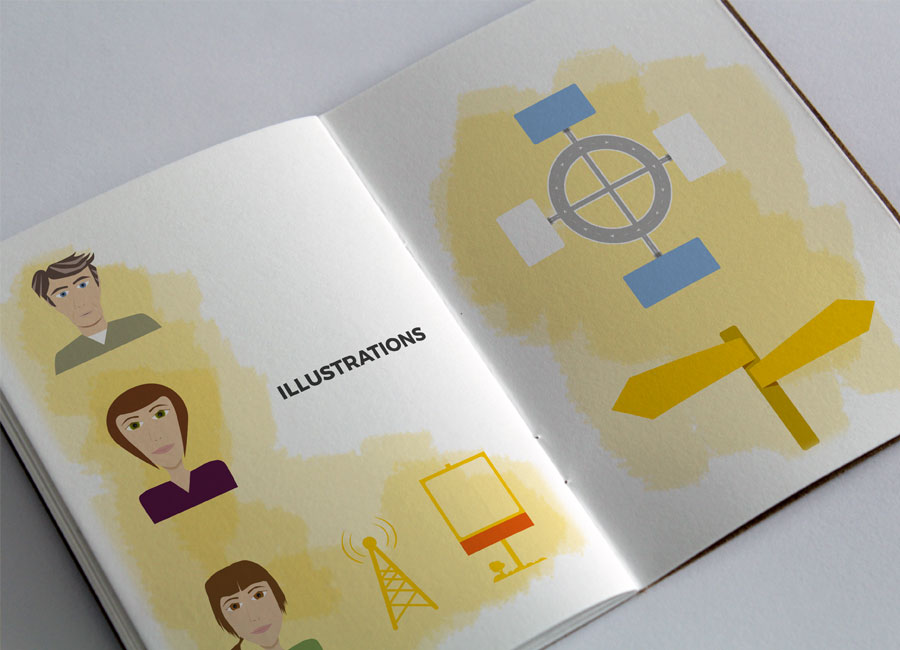
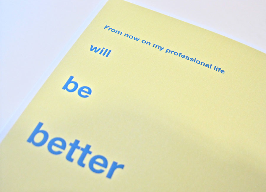
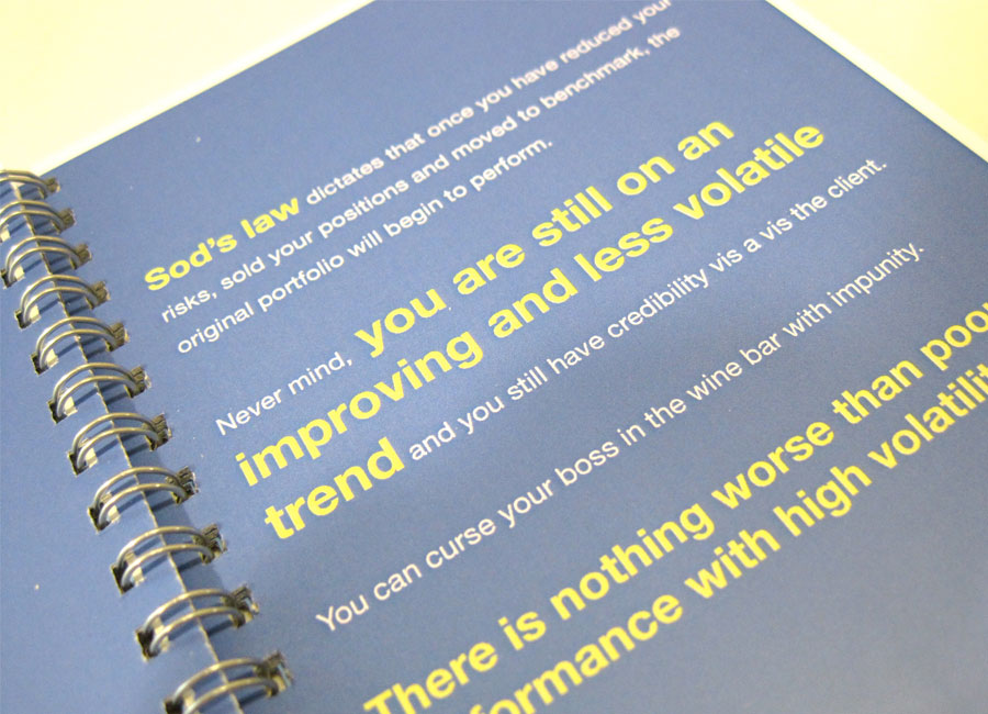
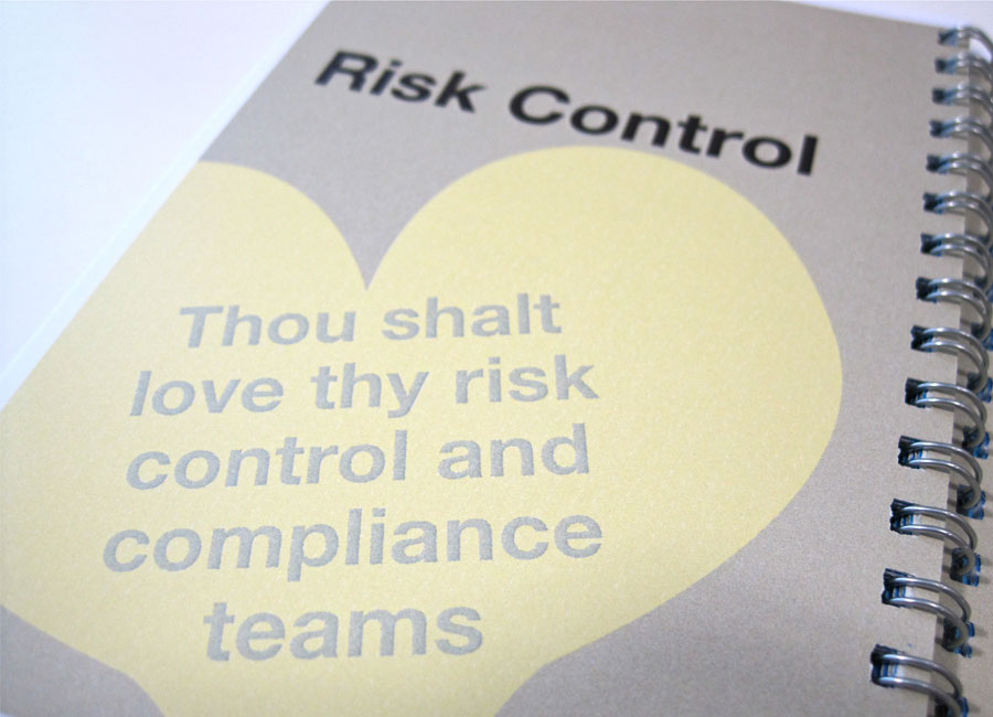
Brief: To push the barriers of the corporate brand and create an A6 booklet of dynamic design to celebrate the investment style of one of AXA IM's most sellable Fund managers.
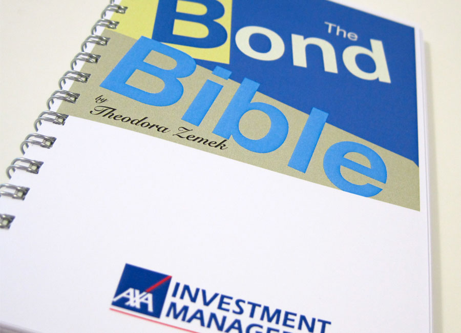
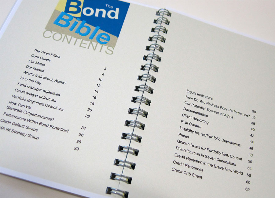
I could deviate from the AXA IM Corporate palette and pick my own colour scheme. I picked two softer blues to the standard AXA IM corporate blue. I complimented this with other earthy colours - stone, cream and a soft yellow.
Phrases and Fund manager quotes I made into double page spreads with bold fonts and used acute angles to purposefully contrast the message in the words.
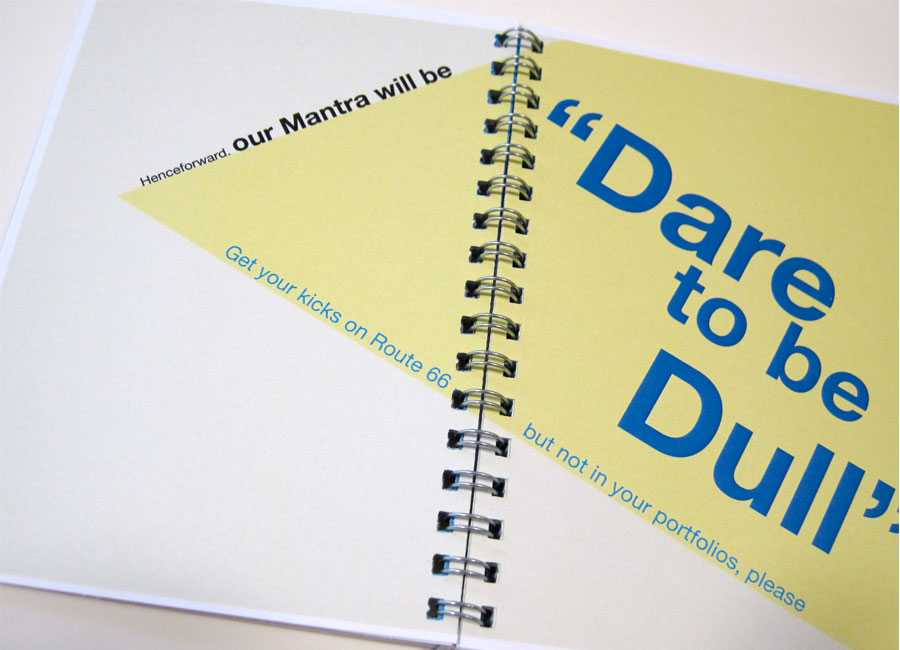
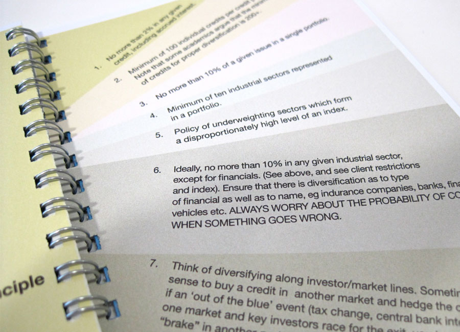
Bold statements were also used alongside more text heavy pages with the use of bold colour against neutral stone.
